Nebula DateChooser Widgets
DateChooser
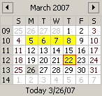
 GRAY theme (default) |
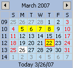
 BLUE theme |
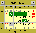
 YELLOW theme |
DateChooser widget presents the monthly view of a calendar for date picking.
Features :
- Month names, weekday names and first day of week depend of the locale setted on the calendar.
- Support for mouse and keyboard navigation.
- Customizable look & feel by themes (colors, font, lines) (3 themes provided).
- Shows days from adjacent months.
- Listener for date selection events.
- Support for multi selection and selection of intervals.
- Optional weeks numbers.
- Optional footer displaying the today date.
- Full support of internationalization (days and months names, labels, first day of week, minimal days in first week).
DateChooserCombo
 |
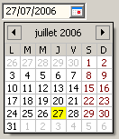
DateChooserCombo widget is a date field editor that combines a text field and a popup calendar. This widget is based on
FormattedText and DateChooser.
Features :
- See FormattedText for text features. Uses a DateFormatter.
- See DateChooser for popup calendar features.
- Customization of locale, date mask, font and colors (themes are shared with DateChooser).
NOTE: The DateChooser and DateChooserCombo widgets are in an ALPHA state. The API is stable, but users should expect changes in future versions: add of new features, minor behavior changes.
Update History (like release notes)
